

正文
采用CSS3的动态元素(动画)设计div块的层级式展现

 提示:扫一扫查出行
【扫一扫了解最新限行尾号】
复制提示
此练习作品是为学习HTML5+CSS3而设计的(如有不好请大家批评指教~~~)。
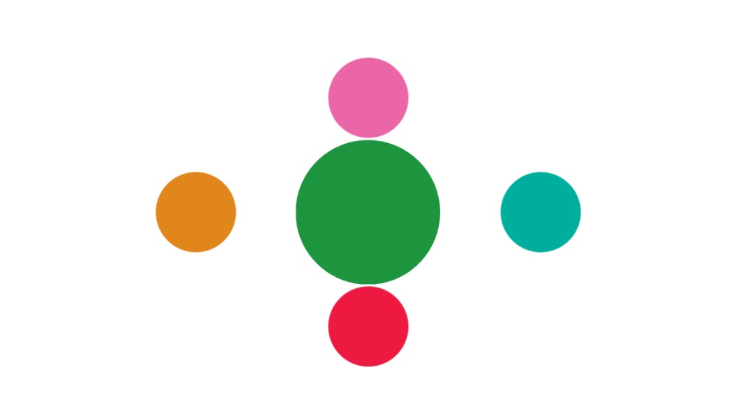
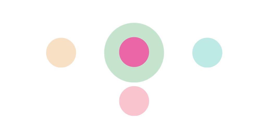
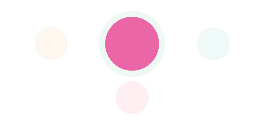
操作:当页面加载时,点击网页中的绿色块(一层),则有其他几块(二层)从其中央出现并向外延伸并旋转,点击这几块中任意一个颜色模块,则被点击的颜色模块将“逐渐”取代原先一层绿色模块,其余模块将渐变消失!
采用了CSS3的动画@keyframes规则设计div块的移动、伸缩、旋转和渐变:
动画定义:animation:animationName;
div块的移动:
@keyframes keyframeName{
from{divInitialLocation:value}
to{divEndLocation:value}
}
div块的伸缩:
@keyframes keyframeName{
from{transform:scale(multipleValue,multipleValue)}
to{transform:scale(multipleValue,multipleValue)}
}
div块的旋转:
@keyframes keyframeName{
from{transform:rotateY(angleValue)}
to{transform:rotateY(angleValue)}
}
div块的渐变(也是利用动画规则@keyframes和标签元素属性opacity来实现的):
@keyframes keyframeName{
from{opacity:InitialValue}
to{opacity:Endvalue}
}
具体代码实现如下:
body部分代码:
<body>
<div id="one"></div>
<div id="two"></div>
<div id="three"></div>
<div id="four"></div>
<div id="five"></div>
</body>
script部分代码:
<script>
window.onload=function(){
var one=document.getElementById('one');
var two=document.getElementById('two');
var three=document.getElementById('three');
var four=document.getElementById('four');
var five=document.getElementById('five'); var twotwo=document.getElementById('twotwo'); one.onclick=function(){
two.style.animation="two 5s";
two.style.display="block";
three.style.animation="three 5s";
three.style.display="block";
four.style.animation="four 5s";
four.style.display="block";
five.style.animation="five 5s";
five.style.display="block";
}
two.onclick=function(){
one.style.opacity="0";
three.style.opacity="0";
four.style.opacity="0";
five.style.opacity="0";
one.style.animation="opacity 5s";
three.style.animation="opacity 5s";
four.style.animation="opacity 5s";
five.style.animation="opacity 5s"; two.style.top="50%";
two.style.transform="scale(2,2)";
two.style.animation="twotwo 5s";
}
three.onclick=function(){
one.style.opacity="0";
two.style.opacity="0";
four.style.opacity="0";
five.style.opacity="0";
one.style.animation="opacity 5s";
two.style.animation="opacity 5s";
four.style.animation="opacity 5s";
five.style.animation="opacity 5s"; three.style.left="50%";
three.style.transform="scale(2,2)";
three.style.animation="threethree 5s";
}
four.onclick=function(){
one.style.opacity="0";
two.style.opacity="0";
three.style.opacity="0";
five.style.opacity="0";
one.style.animation="opacity 5s";
two.style.animation="opacity 5s";
three.style.animation="opacity 5s";
five.style.animation="opacity 5s"; four.style.left="50%";
four.style.transform="scale(2,2)";
four.style.animation="fourfour 5s";
}
five.onclick=function(){
one.style.opacity="0";
two.style.opacity="0";
three.style.opacity="0";
four.style.opacity="0";
one.style.animation="opacity 5s";
two.style.animation="opacity 5s";
three.style.animation="opacity 5s";
four.style.animation="opacity 5s"; five.style.top="50%";
five.style.transform="scale(2,2)";
five.style.animation="fivefive 5s";
}
}
</script>
style部分代码:
<style>
html,div,body,canvas{
margin:0;
padding:0;
}
div{
//border:1px solid;
border-radius:50px;
}
#one{
position:absolute;
height:100px;
width:100px;
top:50%;
left:50%;
margin:-50px 0 0 -50px;
animation:one 5s;
border-radius:50px;
transform:scale(2,2);
background:#1d953f;
}
#two{
position:absolute;
height:100px;
width:100px;
top:25%;
left:50%;
margin:-50px 0 0 -50px;
//z-index:1;
//animation:two 5s;
display:none;
background:#ea66a6;
}
#three{
position:absolute;
height:100px;
width:100px;
top:50%;
left:25%;
margin:-50px 0 0 -50px;
//z-index:2;
//animation:three 5s;
display:none;
background:#e0861a;
}
#four{
position:absolute;
height:100px;
width:100px;
top:50%;
left:75%;
margin:-50px 0 0 -50px;
//z-index:3;
//animation:four 5s;
display:none;
background:#00ae9d;
}
#five{
position:absolute;
height:100px;
width:100px;
top:75%;
left:50%;
margin:-50px 0 0 -50px;
//z-index:4;
//animation:five 5s;
display:none;
background:#ed1941;
}
@keyframes one{
from{transform:scale(1,1);}
to{transform:scale(2,2);}
}
@keyframes two{
0%{top:50%}
50%{top:25%;transform:rotateY(0deg);}
100%{transform:rotateY(360deg);}
}
@keyframes twotwo{
0%{top:25%;transform:scale(1,1);}
50%{top:50%;transform:scale(1,1);}
100%{transform:scale(2,2);}
}
@keyframes three{
0%{left:50%}
50%{left:25%;transform:rotateY(0deg);}
100%{transform:rotateY(360deg);}
}
@keyframes threethree{
0%{left:25%;transform:scale(1,1);}
50%{left:50%;transform:scale(1,1);}
100%{transform:scale(2,2);}
}
@keyframes four{
0%{left:50%}
50%{left:75%;transform:rotateY(0deg);}
100%{transform:rotateY(360deg);}
}
@keyframes fourfour{
0%{left:75%;transform:scale(1,1);}
50%{left:50%;transform:scale(1,1);}
100%{transform:scale(2,2);}
}
@keyframes five{
0%{top:50%}
50%{top:75%;transform:rotateY(0deg);}
100%{transform:rotateY(360deg);}
}
@keyframes fivefive{
0%{top:75%;transform:scale(1,1);}
50%{top:50%;transform:scale(1,1);}
100%{transform:scale(2,2);}
}
@keyframes opacity{
from{opacity:1}
to{opacity:0}
}
</style>
效果图如下:
第一幅图:
第二幅图:
第三幅图:
更多知识分享:微笑空间站


